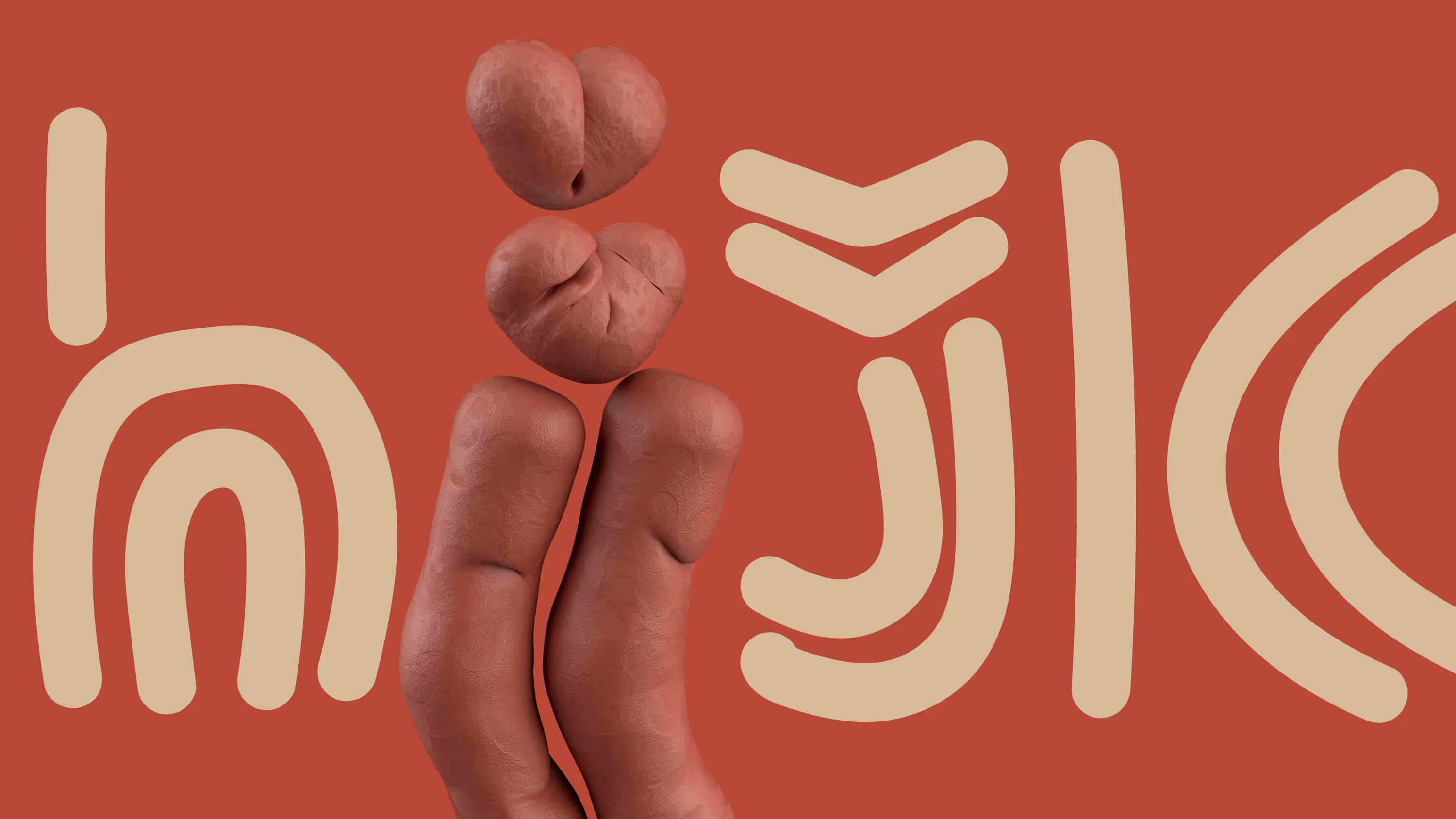
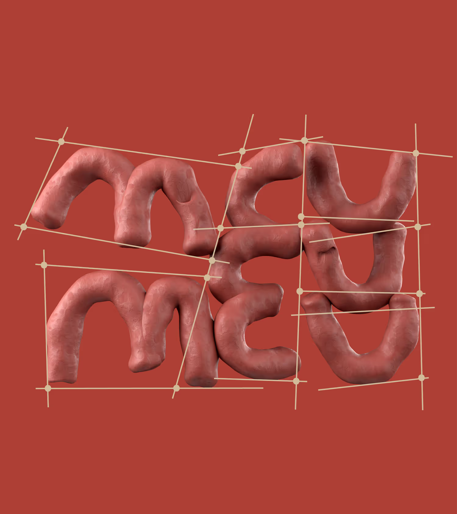
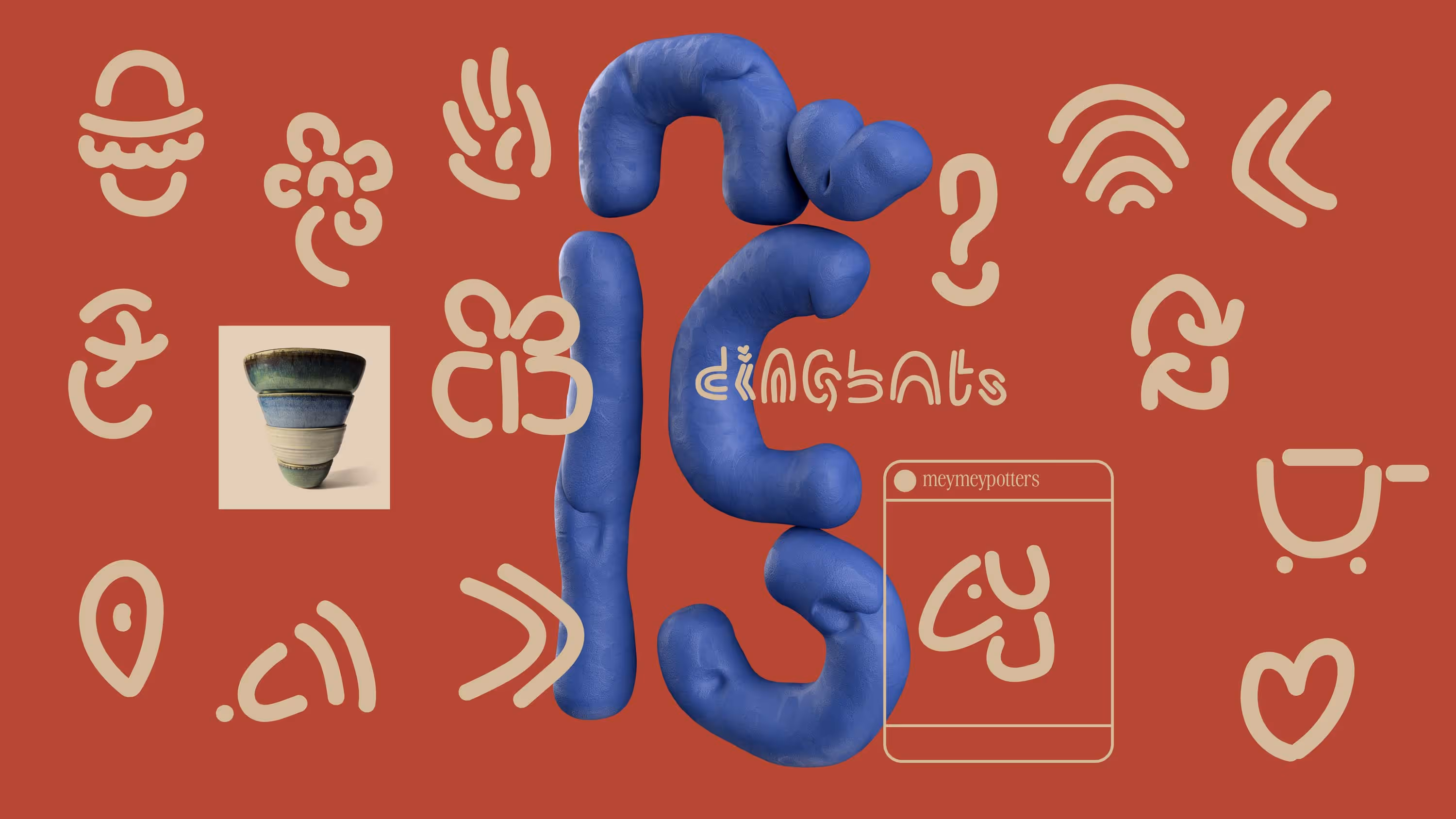
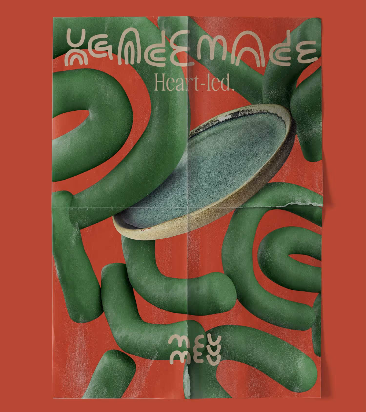
meymey

Made by hands
• Visual language • Brand Identity • Communication • Brand Guide
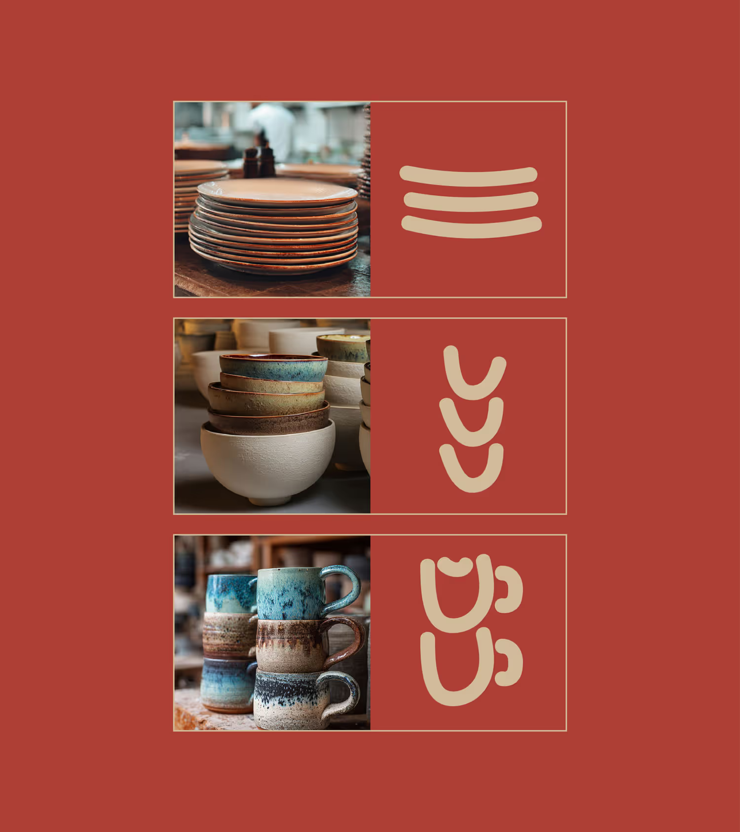
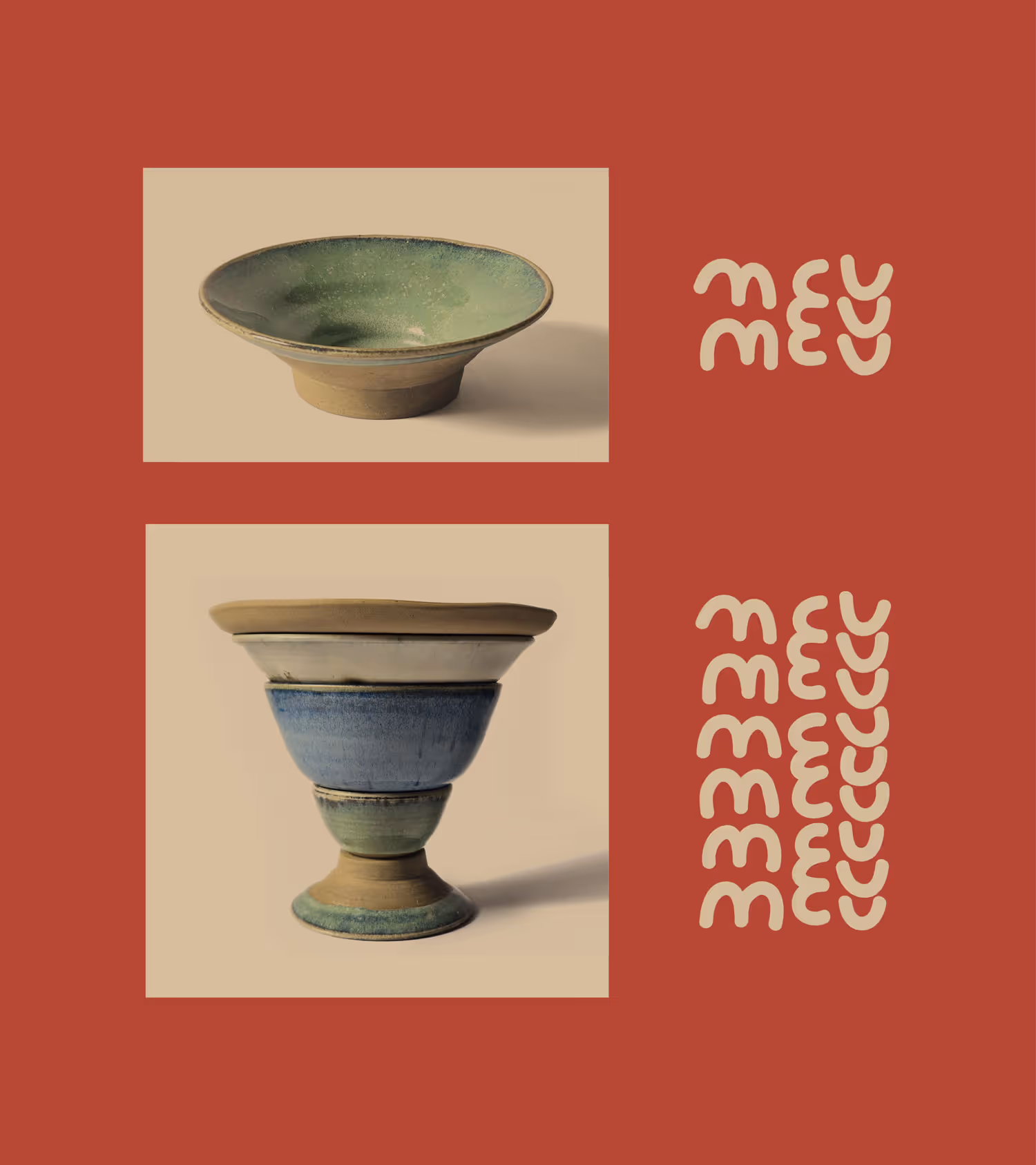
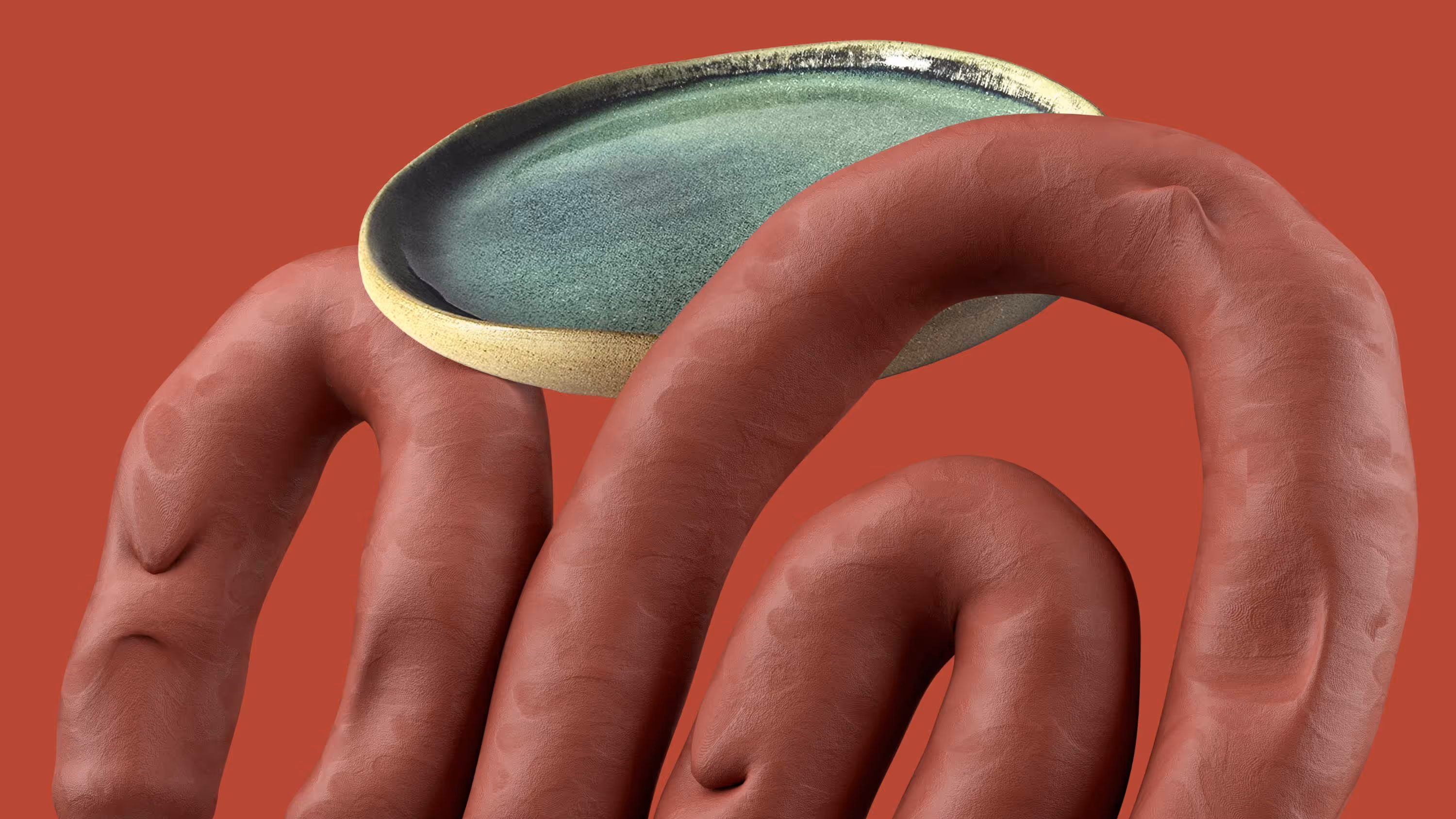
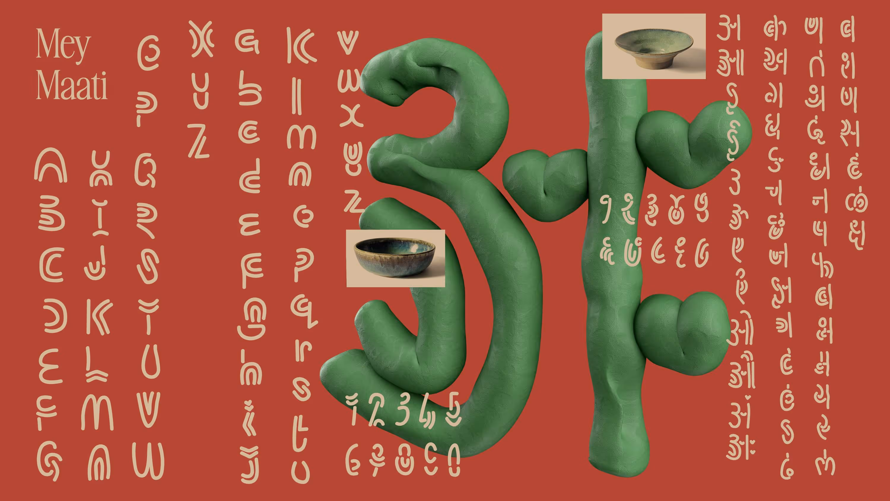
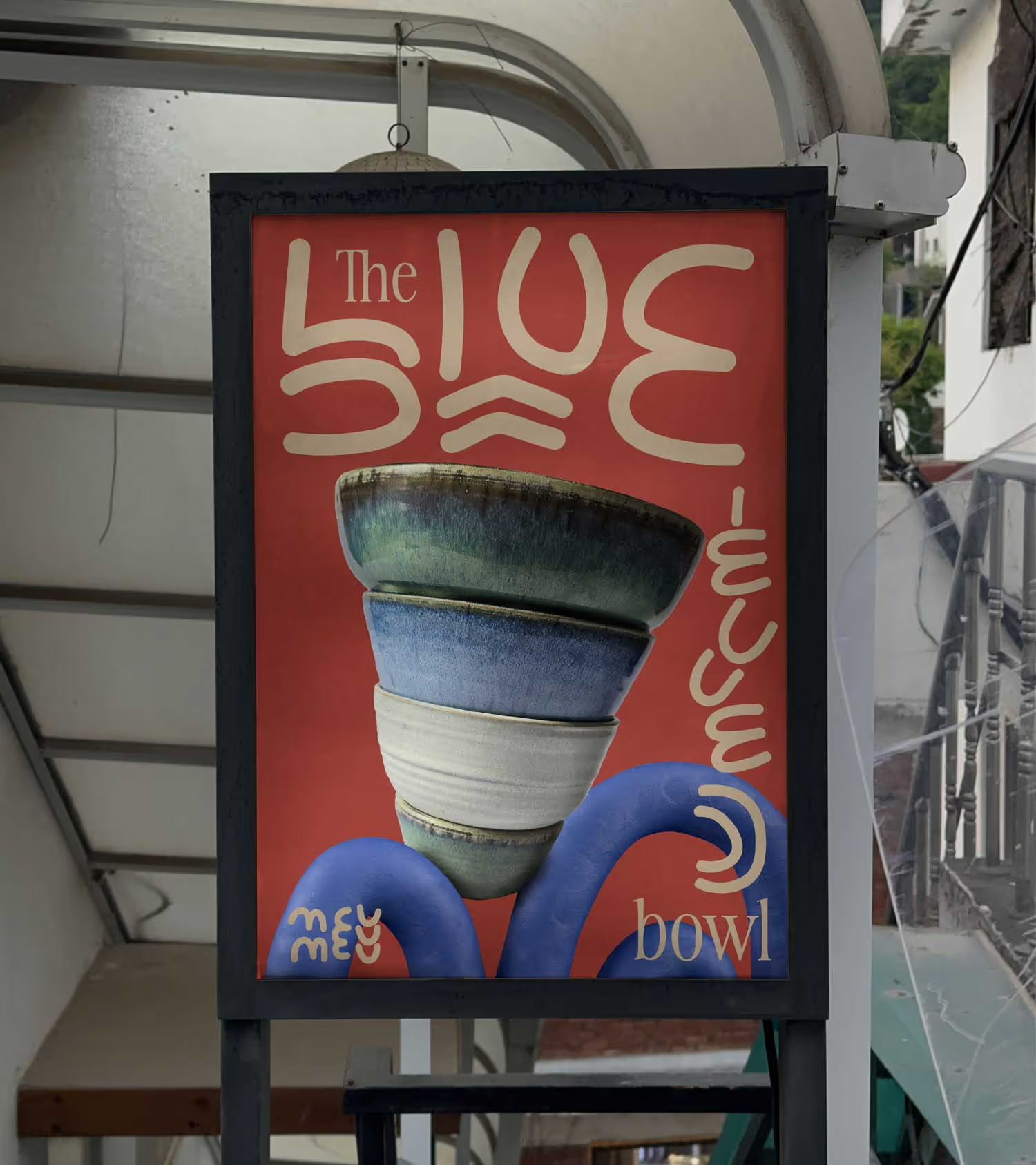
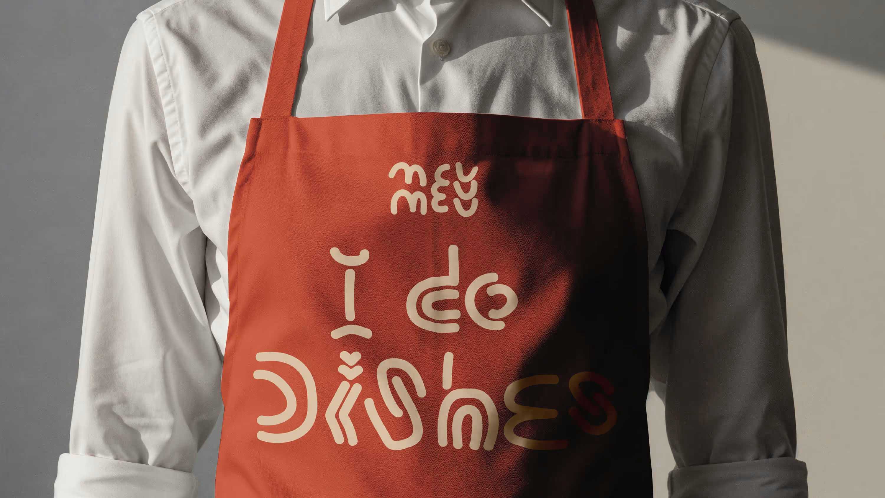
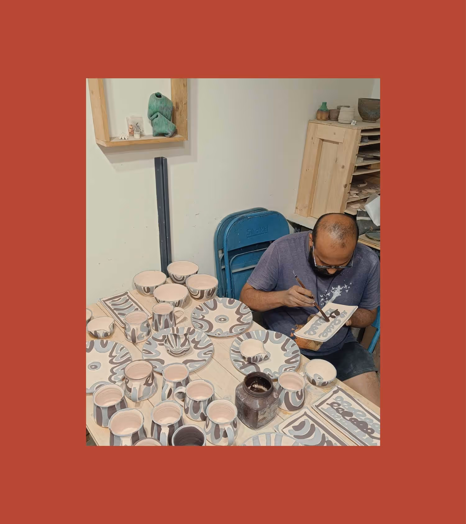
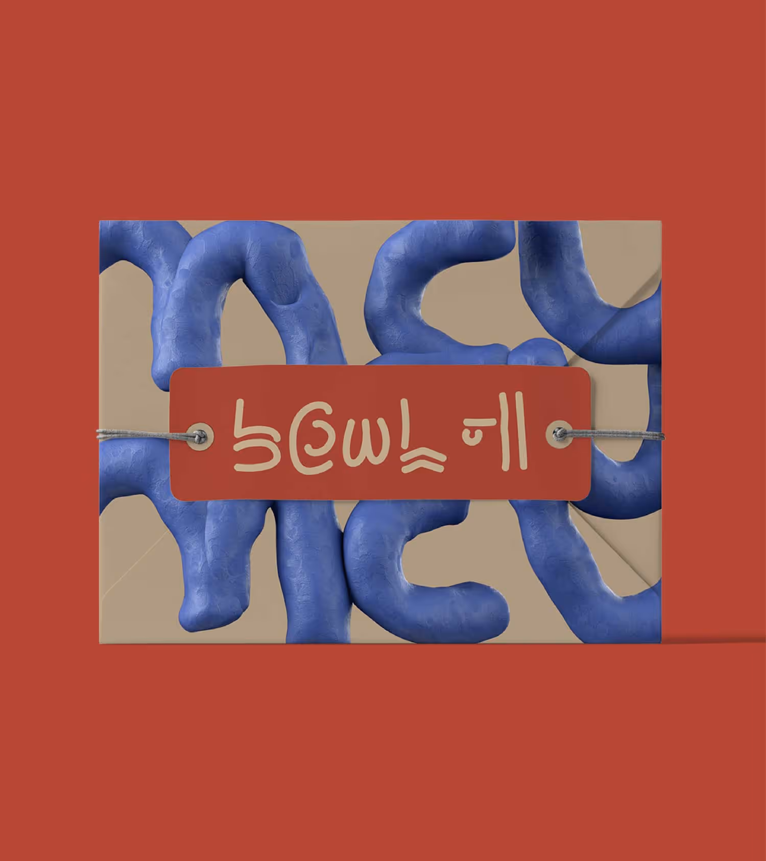
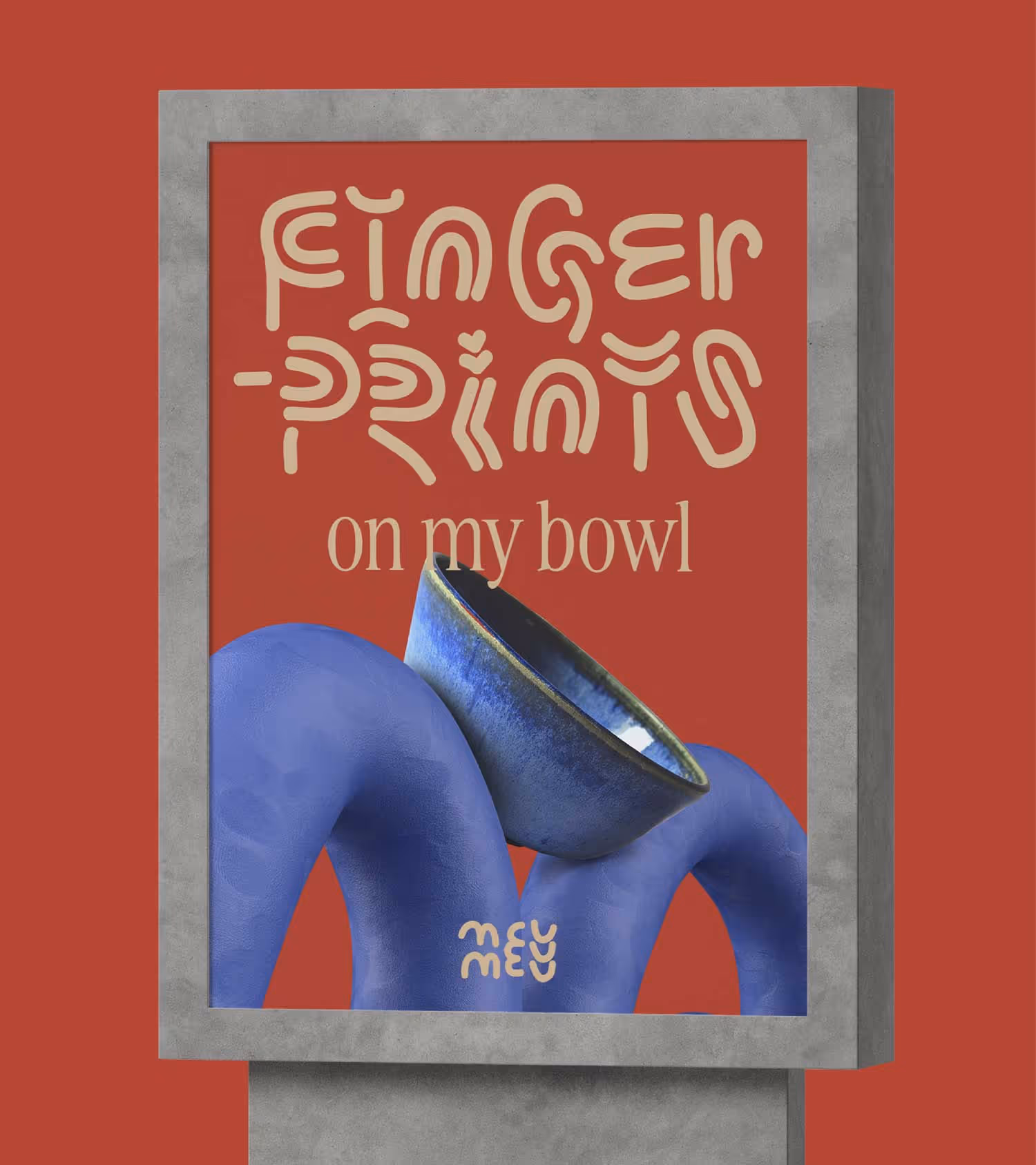
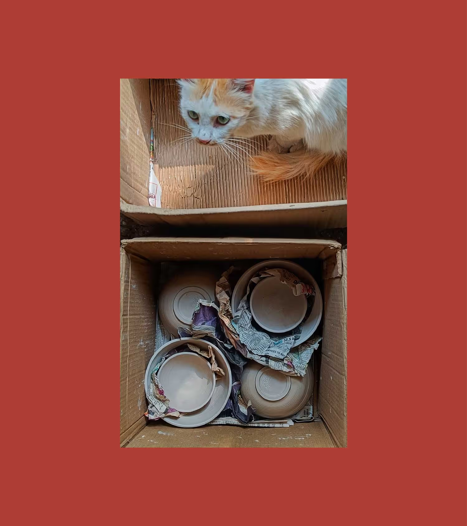
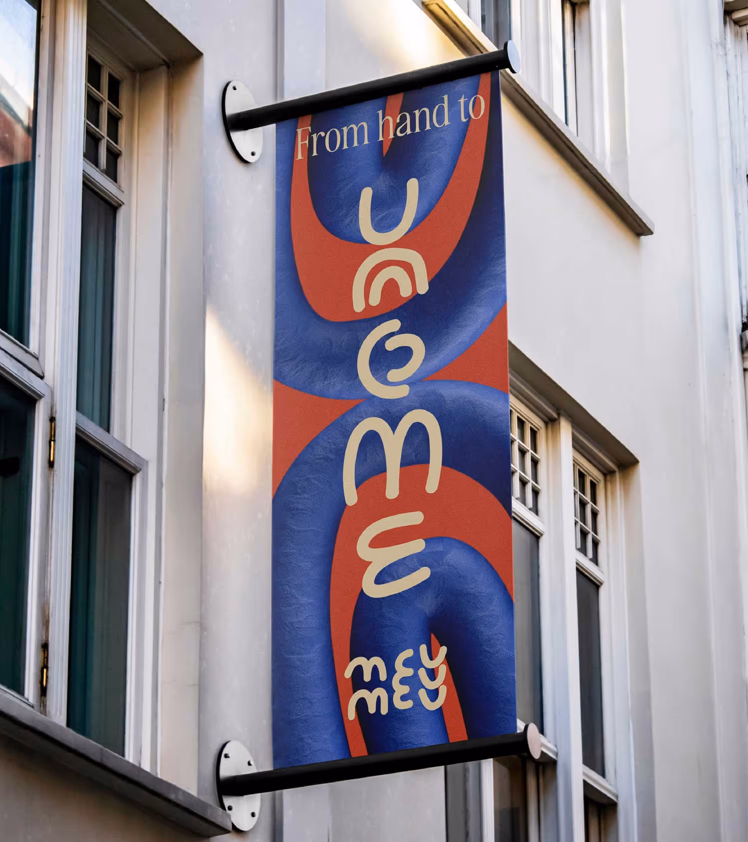
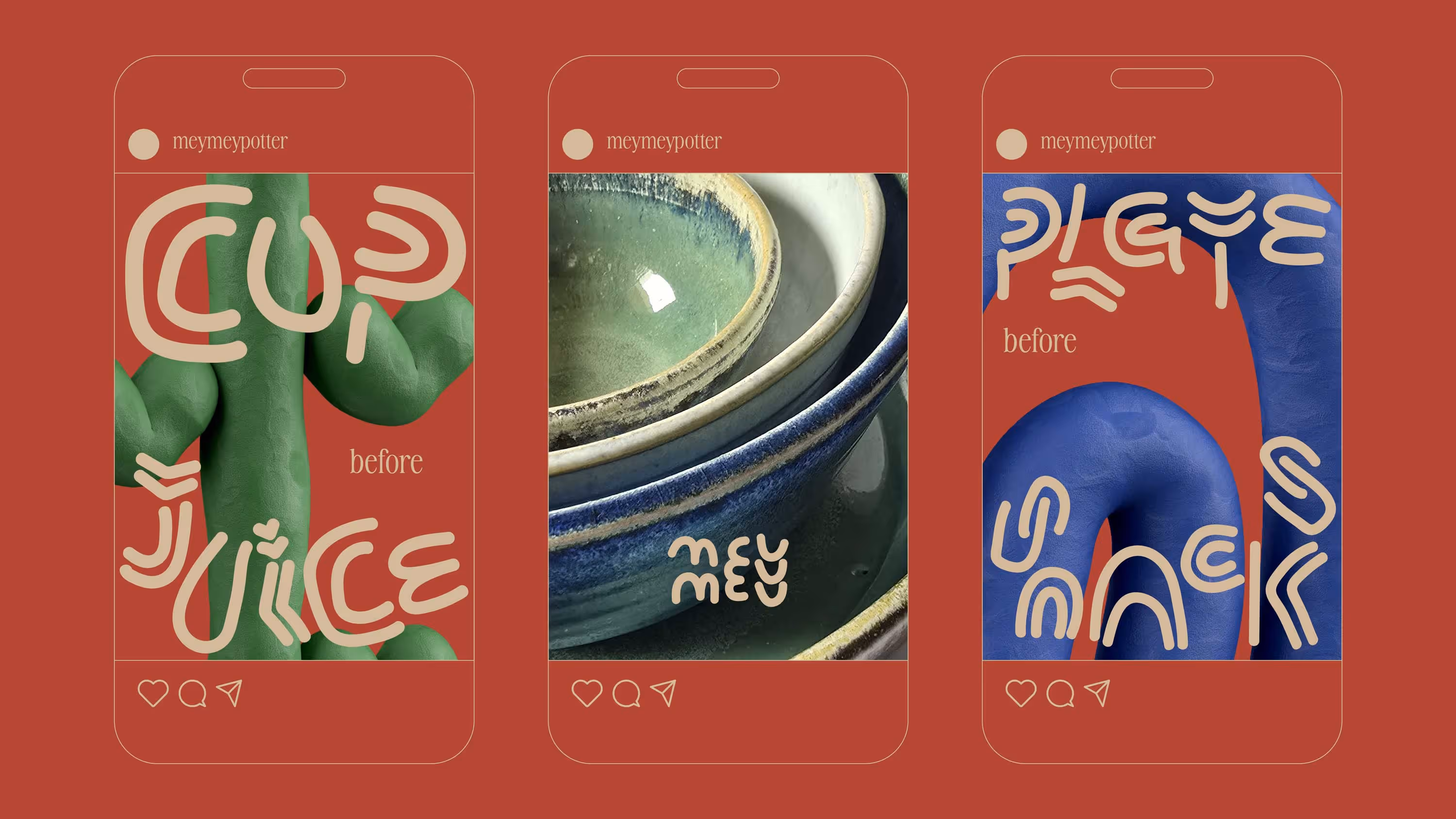
Mey Mey is a pottery studio that finds its roots in the quiet intentionality of Japanese ceramics. Started by Amey Kulkarni—ceramicist, friend, and founder—the studio creates everyday crockery with extraordinary care. Every piece is hand crafted, not manufactured. When Amey approached us, the brief was simple: create a brand that felt as honest and grounded as the work itself. Together, we developed the identity, visual language, and a design system that could hold the weight of the brand’s philosophy.
Built like the product
The idea behind the identity came from the most intuitive insight—how crockery is stacked. Inspired by this act, we designed the Mey Mey logo to echo the very nature of the product: layered, intentional, and minimal. The form is raw by design—something that feels made, not manufactured. The letterforms are hand-built and can just as easily be shaped with clay. It’s an identity that doesn’t just represent the product—it behaves like it.
Stacking the way forward
To carry this thinking forward, we created a brand typeface built on the same stacking structure. It extended the idea across communication while keeping it visually distinct and deeply tied to the category. We also designed custom wrapping paper using core brand elements—transforming a functional packaging need into a thoughtful brand experience. Each element of the brand was meant not just to be true to the category, but to be true to the maker as well.
Hand crafting category insight into brand identity.
play
pause